Ah, Love, Beauty,…and Deception

After a pleasant visit with family at The Met, including a decadent stop in the member’s dining room, I stopped in for a lecture on the French Baroque artist Valentin. Imagine my pleasure in discovering one of the speakers was a favorite professor from the University of Delaware, David Stone. A Caravaggio scholar, he was examining the career of this French follower of the big C and looking for references and quotations.

They are all over the place, and I enjoyed having David open my eyes once again. He pointed out the freshness of vision of Valentin, which had been easy for me to miss.

Visiting the exhibit afterward, where did I linger? Over the witty paintings of deception borrowed from Caravaggio’s The Card Sharps.

Image result for caravaggio cardsharps

Caravaggio. The Card Sharps. c1595.

Image result

Valentin. Cardsharps. c1615.

Note that being lost in the love and beauty of your own music could get your pocket picked. To me, this reads as a metaphorical lesson to look outside oneself.

Valentin. Musicians and Drinkers. c1625.

Music seems to play a role in the deceptions throughout the gallery. It was also dotted with the instruments depicted in the paintings, some unusual to my eye.

Lute and Spinet

Archlute


Perhaps my favorite work is the fortune teller who doesn’t see the present well enough to know she was being robbed. What Valentin did was riff on the same subject Caravaggio introduced in clever ways.

Image result for valentin de boulogne fortune-teller 1626

Valentin. Fortune-Teller. c1626-8.

The exhibit is dark, lush, and romantic like the paintings. So the bright lightness of the Jean Honore Fragonard drawings and prints exhibit was just right for the cotton-candy Rococo that followed the Baroque. I was still in France but now celebrating the frivolity of love and romps in the park.

Image result for fragonard island of love

Jean Honoré Fragonard. The Island of Love. c1770-80.

The drawings and prints are delicate and frothy like his paintings. A joy to behold.

Image result for fragonard draftsman in a trellised garden

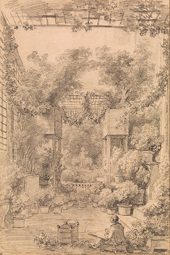
Jean Honoré Fragonard. Draftsman in a Trellised Garden. c1770-2.

Over in the Breuer Building, which The Met inherited from the Whitney, is the joyous look at lobe by Kerry James Marshall. The exhibit is filled with his giant genre paintings of everyday black life, and in the 2000s, he began focusing on love, directly inspired by Fragonard. Edging away from identity politics, he painted masterpiece-inspired scenes of ordinary romance. Normalizing black love was his goal and challenge to a white audience.

I loved so much of this exhibit by the Chicago artist. I felt uplifted by it in this time of racial anger.

Enjoy the sensual love of Slow Dance.

Image result for kerry james marshall

Kerry James Marshall. Slow Dance. 1992-3.

The delights of two versions of the Fragonard-quoting Wishing Well.

Image result for kerry james marshall wishing well

Kerry James Marshall. Wishing Well. 2012.

Can you tell he uses glitter? Love that!

Image result for kerry james marshall wishing well

Kerry James Marshall. Wishing Well. 2012.

And the complexities of School of Beauty, School of Culture. Like Velazquez’s Las Meninas, Marshall puts himself in the scene, obscured by a camera flash rather than a giant canvas.

Kerry James Marshall. School of Beauty, School of Culture. 2012.

Directly referencing the English Renaissance artist Hans Holbein, he uses the same visual anamorphic trick. When walking from side to side, the image will come into focus and clarity. But instead of a skull reminding us of our mortality, he uses a white beauty icon as a reminder of how dominant white culture ideals distort the black experience of beauty.

The anamorphic trick doesn’t quite work; the blonde would appeal undistorted if it did.

Detail.

But no matter. There’s so much to love and investigate. Note the toddler peeking around at the cartoonish white face, trying to make sense of its strangeness here.

The enormous painting creates an entire world to step into, and its wonderfully inviting!

As a delicious coda, Fragonard’s 17-year-old sister-in-law Marguerite Gérard (who goes on to a notable art career) copied Fragonard’s drawings as he instructed her in printmaking. She made this rather hilarious (to our contemporary eyes) print featuring Ben Franklin.

Yes, that’s Franklin at center. His face is so unmistakable that the print literally stopped my slow stroll through this French art gallery. What is this? I wondered. Please let me decipher it for you.

Ben is being protected by Minerva and her shield overhead, as he instructs Mars, god of war, to slay the enemies of America! You can’t leave her out of any allegorical scene of the brand new nation. There’s America in her truncated feather headdress, leaning on Franklin’s knee.

If you ever doubted Franklin’s celebrity in Paris, here’s your most exquisite proof!

Image result for marguerite gerard genius of Franklin

Marguerite Gérard. The Genius of Franklin. 1778.

Above the Line

I did my day backwards. Starting from a reflective, quiet experience, I ended with a quarreling barrel of noise and anger that fueled the Trump victory.

Story of my life at the moment. Escaping into art before being forced into reality.

Agnes Martin made over 600 paintings exploring emptiness, energy, seeing, and surprisingly, joy.

2016-11-26-10-40-57

The show at the Guggenheim opens with this oddly shaped room hung with the entire ethereal series Islands I – XII from 1979. Here in Martin’s signature style, the paintings explore light and form and formlessness. She challenges us to slow down and look in order to really see. This is the work of art. To make us slow down and think, feel, remember, dream, and aspire.Martin wants you to experience innocence, freedom, perfection attained and resisted.

Here shapes emerge. Stripes of pale blue and gray. Pencil lines. All revealed up close and melt away at a distance. The pieces unite and converse, push against each other for space. They look stunning with the architecture.

2016-11-26-11-18-09

Martin explained that she works in a meditative way, emptying her mind and waiting for inspiration. For her, inspiration is emotional, and the intellect does not produce artwork. So despite what you see, her works are not minimalist, mathematical explorations of line, color, shape. You can see the artist’s hand.

Loving Love, 1999

Untitled, 2004

painterly detail

painterly detail

Instead emotion fills her intention, and she argues the work, like the Abstract Expressionists. And not just any emotion.

Loving Love, 1999

Loving Love, 1999

Martin says she draws a line and chooses to live above the line, with happiness, beauty, and love. By this approach, I’ve been living below the line since the election. After 9/11, art pulled me above the line. I don’t know what will this time.

Going to the Jewish Museum certainly wasn’t the answer. Although ostensibly I went for the John Singer Sargent portrait on loan, aching for his bravura splashes of color after the austere monochromes of Martin.

But I was literally swept into the bright noise of Take Me (I’m Yours). This democratic space lets artists express in the moment, and the below-the-line anger oozed through the rooms.

2016-11-26-11-58-10

With objects to take ranging from pills to lemon water and t-shirts and ribbons to words on paper and words on the wall, I filled the bag provided. My bright yellow ribbon states “It is not enough to be compassionate” in hot pink serif letters. This was the cleanest saying hung for the taking.

2016-11-26-11-58-06

The t-shirt: “freedom cannot be simulated.”

2016-11-26-12-00-20

What tore my heart open was the poster created by Jonathan Horowitz before Election Day. I couldn’t bear to take one, although it was probably the most popular object in the exhibit. Now who’s face will join the portraits?

2016-11-26-12-08-37

Martin’s Taoism that had so calmed and uplifted me vanished immediately.

I don’t know why I decided to follow through on my ticket purchase for Lynn Nottage’s “Sweat.” But I went and found the violent yelling and seething racism of working class plant workers  just more than I could take.

Yes, the play was written and even opened before the election. I bought my ticket when I could assume my pedestal height to empathize with their struggles for work, which in my privileged way I share, so a connection. I couldn’t make it past intermission.

I get it: working class white America is angry. Now liberal America is angry. What do we do with all this anger? How can we get back above the line?

Untitled, 1960, looks like a textile

Untitled, 1960, looks like a textile

Or do we need to blur the lines or weave the lines? Try something new?

detail; see each one of us showing up

detail; see each one of us showing up


Shining Future

Today has been my first day to not be brave and reasoned since the election. I spent some time wallowing in videos of post-election sense-making and then decided to take in this glorious fall day in downtown New Haven.

Walking through the Yale campus, I paused at the chalk writings covering the plaza and sidewalk outside Sterling Library. Students declaring they’re still here. They’re not leaving. Everyone wants to be seen and heard. Everyone. This need is not limited to the victors.

Over on Church St, a march was noisily passing by.

I stepped into the Yale University Art Gallery for my now daily dose of art as medicine. I hadn’t yet seen the Yosemite exhibit and having taught the promise of the West with my students, I really needed to see what YUAG had uncovered from its own collection.

2016-11-13-14-31-32

Since the plethora of eye surgeries have created some new abilities, I was happy to discover another one. For the first time in my life, I can actually see the 3-D image form using a stereoscope. And it is marvelous! I sat with this one for several long minutes studying every detail.

Image result for underwood and underwood yosemite falls, from glacier point trail 1902

Underwood and Underwood. Yosemite Falls from Glacier Point Trail. 1902.

The flanks of the horses, the overlap to the lone shrub, the droplets of water seemingly visible from the falls, I marveled at every detail and “you are there quality.” I get it. I understand why these things were such a major form of entertainment in the late 19th and early 20th centuries.

This image was one of 3 with stereoscopes in the exhibit. I was arrested by it in particular, I think, because of the journey it promises.

Albert Bierstadt. Yosemite Valley, Glacier Point Trail. c1873.

Standing in front of this large painting by Albert Beirstadt, I realized something. As one tear slid down my check, I understood why this moment is even worse for me than 9-11.

Then, I felt shocked and stunned because we were victimized into an awareness finally that Americans are not universally beloved. Art was my savior then, too. I stood many mindless moments absorbing an Impressionist painting of a winter scene, part of a special exhibit at the Phillips Collection at the time, before I realized beauty was what I needed an an antidote. I turned my life toward art.

No, this moment is different. Americans are not victims this time. We have stabbed ourselves in the heart. I feel broken in a new way that became evident when meditating on this glorious evocation of the belief in the American promise.

That saturated golden light represents the future infused with American values, rights, and systems. The journey toward the spiritually evanescent light calls to all of us in the foreground to journey toward it, to be clear-sighted, and stay the course to the future.

That light for me now has been snapped off.

It’s been a long run and a mostly good one since this promise was made after the Civil War. Perhaps, in the grander scheme of things, it’s time for another country’s light to shine bright.


Framing Space

Talk about getting into the head of an artist.  Go to their home.  Go to their studio.  Three years ago, Donald Judd Foundation completed a $23 million restoration of the cast iron building he bought in 1968.  I got to visit and really get into his head.

At the time, Judd spent a year rehabbing the industrial building in Soho, that he picked up for $68,000–not much for a building, but a clear indicator that the 40-year-old, Minimalist artist was doing well financially.  By the time of his death in 1994, he had created a space here with intentional installations, the way he wanted the space kept and seen. 

Little has changed since that time, other than the rust was removed from the exterior and the interior gleams.  What we can now enter is the artist’s vision for space installed according to Judd’s philosophy and aesthetics.

2016-10-29-11-20-03

The two black boxes above are Judd’s work.  He was interested in making us aware of space–framing, capturing, measuring space, using clean lines and simple colors.  He was a theoretician who studied philosophy and carried both over into his work.

Shunning the language of sculpture and architecture, he called his works “objects.”  He wants to make us aware of the space itself as an object.  To make space material.  Are you lost yet?  Being in his living space grounds these ideas out of the theoretical realm.

You can see here the four-ton Judd cube placed in the large open space of his “studio.”  The cube frames a chair facing out toward the windows.  The entire floor is full of contained spaces. 

Judd’s studio was not for making, but rather for thinking, reading, and writing.  I can imagine an idea forming from where we are standing, traveling through the cube, past the reflecting chair, and out into the world.

Image result for donald judd foundation

The studio wasn’t off limits to his family.  You can make out the children’s desk and chair in the left corner where the children would come do their homework.

In that sense, the house isn’t precious.  It was meant as a family home.  I was delighted to learn that Judd designed furniture, created out of pine and Douglas fir.  His trademark straight lines and straightforward designs transfer to the home.

Here you see the table and chairs of the dining room.  Note that the top of the chairs is flush with the top of the table, creating a pleasing line and another cube-like shape.  Judd himself was very tall, well over 6′, and I wondered how he could tuck himself into the straight-backed, low-to-the-ground chairs.  But they look smashing.

In case you’re curious, you can buy a replica for about $2000 per chair or $10,000 for the table, all still handmade to Judd’s specifications.

Image result for donald judd foundation

For the same space, Judd designed a banquette on wheels shaped like a cube and a table doubling as a clever storage piece, with hinged doors on top opened to reveal glassware and tableware.

The second floor (of the five we visited) is the most overtly public space with Judd-designed built-ins.  There are two doors flush to the wall, sized according to each child’s height.  They open to closets.  Nearby is another door, again flush, that opens to reveal a puppet theater. 

Judd loved industrial materials and collected gadgets and restaurant equipment for the kitchen.  When they lived in Soho, the area wouldn’t have been full of restaurants.  They would have cooked and entertained in this space, with its huge windows connecting to street life.

He subdivided the spaces with their tall ceilings by designing lofts with ladders for access.  In the bedroom here, he built a loft space for his son, Flavin.  His son was named for Dan Flavin, a good friend and also the artist for the room-long, neon light piece on the right.

Image result for donald judd foundation

By 1974, Soho had become an artsy area, which for Judd meant the end of its appeal.  He shunned the commercialization of art.  After searching for larger spaces outside of New York, he moved his family to Marfa, Texas.  There he built a compound of buildings that supported his experiments in framing space,  including the vast plains and mountains around the small town.

While his marriage didn’t survive this move, his work and influence grew outside of New York.  Experiencing the space he so carefully crafted, both in Marfa and now in New York, brings his sensibility profoundly alive.

The nights get longer

As we approach Labor Day, the psychological end of summer, I’ve been noticing how much shorter the days are already.  Maybe that’s why I fell under the spell of “Electric Paris” on view at the Bruce Museum.

Only the French would design an electric light pole that looks like this.

Image result for charles marville opera lampadaire

Charles Marville, Opéra (Lampadaire), c1865-9

Charles Marville went around the city photographing the extraordinary lamp posts.

Image result for charles curran paris at night

Charles Curran, Paris at Night, 1889

Even so, perhaps no surprise to you, I could give a pass on most of the French artists and their take on their city.  But I was mesmerized with this Curran painting, with its Americanist approach and style.  Look at how the gas lamplight dances on the street and the oil lamps on the carriages glow.  I can hear this painting.  Can’t you?

1889 was a big year in Paris, as it hosted the Universal Exposition celebrating the centennial of the French Revolution.  Artists like Curran were quick to capture the buzz of the spectacles–readymade scenes that pull us in and put us right there.

Image result for charles curran evening illuminations at the paris exposition

Charles Curran, Evening Illuminations at the Paris Exposition, 1889

Careful!  You might get jostled by the crowd!

See that vertical streak of color in the background on the right?  That’s the effect of the water fountains lit each night at 9 p.m. during the fair.  The water jets were illuminated by electric arc lamps with colorful glass plates to create the cotton candy effects you see.

You might just be able to make out the Eiffel Tower, at this moment of its unveiling to the world, in the far right background.  It served as the entrance to the fair and was the tallest human-made structure at 1000′ at the moment Curran captures.  It was lit by two electric search lights at the top, with thousands of gas lamps.  By the 1900 World’s Fair, the Eiffel Tower was fully electrified by 5000 incandescent lights.

Here’s Alfred Maurer’s look at the monument.

Image result for alfred maurer nocturne paris

Alfred Maurer, Nocturne, Paris, n.d.

Now you can make out the beams at the top.  Maybe we can take a break and lean up against the rail, too.  You can see why the Eiffel Tower has become the symbol of Paris as the City of Light.

And you can get a sense of how fascinated American artists were with painting the night scene, as it was changing with technology.

Image result for theodore butler place de rome at night

Theodore Butler, Place de Rome at Night, 1905

Don’t you have a sense of the night energy?  Light slashes on the wet pavement.  People are mere impressions as they move about their night.  Everything pulses with the vigor of the city.  Butler takes us way up over the scene, several stories up.  We look down on all the hustle and bustle, transfixed by light and color, now anathema to the dark night.

Night life moves inside with Everett Shinn.  In many of his paintings, he puts us right up front in the theater.

Everett Shinn, Theater Box, 1906

Everett Shinn, Theater Box, 1906

We’re seated in the box, just behind this woman with her deeply-decolletaged, sage green, pillowy dress.  Don’t you love how the faces of the other audience members get lit up?  This is truly a shared experience.

But sometimes, the night is just quiet.  And who better to give us such a scene than the painter of quiet, Henry Ossawa Tanner?  An African American painter, Tanner left the U.S. to live in Europe where his classically-inspired religious works were better received with less overt racism.

Image result for henry ossawa tanner, the seine - evening

For Tanner, light was religious.  Sparks of spirit.  Perhaps you feel that, too.

With nights like this, we might not mind the shorter days so much.  Happy Labor Day!


Stevan Dohanos

Stevan Dohanos, Star Pitcher

Here’s a recent article I wrote for ConnecticutHistory.org on a notable illustrator of Connecticut life, Stevan Dohanos.

If you are so inclined, you can voice your support for Connecticut Humanities, which sponsors the history site.  The agency has lost its entire budget due to the state’s fiscal crisis.  See their website for more information on how to make your voice heard.

Gardens

Having spent an inordinate amount of time in my own garden recently, I found myself interested in the low-maintenance variety.  The Florence Griswold Museum is featuring a joint exhibit with the Pennsylvania Academy of Fine Arts of American Impressionist paintings of gardens.

Here are a few works that caught my eye.

As you know, the Impressionists were all about light and color and thick paint application and that sensation of being in the moment captured in paint.  For me, this lovely Harry Hoffman painting really works in all ways.

2016-07-10 13.17.14

Harry L. Hoffman, Childe Hassam’s Studio, 1909, Florence Griswold Museum

The flickering light in the blossoms is accomplished through paint application which you can see here.

2016-07-10 13.17.25

I could linger for hours in this place.  The cool respite of the porch.  That springtime moment when the fruit trees have burst open.  I love the fresh newness juxtaposed against the comfortably dilapidated.  The real dreaminess of the place.

Charles Curran’s A Breezy Day is visceral, too.  Can’t you feel that gusting against your cheek and tousling your hair?

Charles Curran, A Breezy Day, 1887, PAFA

Charles Curran, A Breezy Day, 1887, PAFA

We don’t see the hard work of the laundry women, the backbreaking toil of scrubbing, wringing, and ironing.  For a moment, we join them outside in the fresh air as the sun peeks through the clouds to bleach the sheets a clean white.

Most Impressionist painters, men and women, conflate their depictions of women with flowers–those ornamental things to be enjoyed for their beauty before it fades.  We observe freely, consume for pleasure, reducing women to objects.  What better way to understand the stifling moment that also spurred women to agitate for suffrage.

There are plenty such paintings in the exhibit.  The one that caught my eye was by a woman artist.

June was created for the cover of a 1902 issue of Everybody’s Magazine, a monthly women’s publication.  Even women artists producing images for women perpetuated the woman-as-beautiful-object trope.  Violet Oakley may have enjoyed her women the same way as any man, if you catch my drift.  Still, as usual, with Oakley, I’m seduced by her vision…

2016-07-10 13.23.01

Violet Oakley, June, c1902, PAFA

…and the charming detail of cutting the frame to catch the full sweep of a skirt.

2016-07-10 13.23.07

By the way, the red rose in Oakley’s signature references the group of women artists she lived and painted with – the Red Rose Girls.

As ever, I find Lillian Westcott Hale’s work refreshingly feminist.  Yes, we have the girl with the flowers–our now familiar symbol.  But the flowers are drooping, and the girl seems to be deep in thought, suggesting her worth lies with her mind, regardless of outward appearance.  Her ideas bloom, even if her transient bouquet does not.  Thank you, Hale.

Lilian Westcott Hale, Black Eyed Susans, before 1922, charcoal and colored pencil on paper, Private Collection

Lilian Westcott Hale, Black Eyed Susans, before 1922, charcoal and colored pencil on paper, Private Collection

But we really don’t have to be analytical or political.  It’s summer.  We can simply relish the beauty of our gardens right now.

So join me in getting up close and personal with a rose and looking at its glories through paint.


2016-07-10 13.30.37


Famous Artists School

Here’s an article just published on The Famous Artists School.  Thank you, ConnecticutHistory.org and Connecticut Humanities!

Group photo of Famous Artists School Faculty

Group photo of Famous Artists School Faculty. Left to right: Harold von Schmidt, John Atherton, Al Parker, founder Al Dorne, Norman Rockwell, Ben Stahl, Peter Helck, Stevan Dohanos, Jon Whitcomb, Austin Briggs, and Robert FASwcett – © Norman Rockwell Museum Collections. All rights reserved.

‘Tis the Season, the Summer Season Up the Hudson

Since the early 1800s, flocks of painters would leave New York City in the summer, with its sweltering heat, and head for the countryside.  The first bunch to make a name for themselves doing this were the Hudson River School.  Those intrepid artists ventured up the Hudson River to the Catskills and beyond, when traveling was tough.

In my comfortable car, I followed in their tracks, to visit the upstate New York homes of Thomas Cole and Jasper Cropsey.  I can’t tell you how much you will fall in love all over again with their paintings, when you spend time in their homes.  They become, well, real, and you can see what they saw and feel what they felt.

Thomas Cole came first and became the titular head of the (non-physical) Hudson River School.  Although not a teacher, almost everything he painted and the way he created his compositions informed artists for several generations.

Even though Catskill, NY was already crawling with tourists by the time Cole lived at Cedar Grove, he painted its wilderness.  You get a sense of what he saw from his porch.  Those beloved mountains.

2016-05-19 14.59.38

I could look at that view for hours, dreaming.  I could also meditate on the up close and personal, seen from another porch angle.

2016-05-19 15.47.12

What stories this tree can tell, and knowing that trees were hugely symbolic for Cole–a symbol of the nature we must all work to preserve–I can imagine he heard them all.

The house has been a restoration-work-in-progress.  And you can really see the progress now, compared to my first visit several years ago.  Now it includes Cole furniture, like his working desk.  Notice the handles on the side for portability.

2016-05-19 15.28.09

I have a thing for artist studios, and two of Cole’s are so lovingly recreated now.  He designed them, of course, with that wonderfully consistent northern exposure, here through that window high up.

2016-05-19 15.51.51

Can you make out on the easel below the notches on the side?  That’s so Cole could raise and lower that horizontal stabilizer for his canvasses, which were huge.  Then he could work more comfortably on different parts of the canvas.  Clever!

2016-05-19 15.53.20

You can also get a sense of how large the studio is, and this is the small one.

Cole made use of a camera obscura, which I didn’t know.  The device uses mirror-lenses and light to create depictions (albeit upside down) of a targeted scene.  The artist then has a way to create accurate details, by tracing the projected image.  Maybe you can get a sense of it here.

2016-05-19 15.54.09

I don’t know if Jasper Cropsey used a camera obscura for accuracy, but I’m sure the Ever Rest guide Tony would know.  The Cropsey scholar gave me a private tour of the 1830s house that Cropsey and his wife bought later in life, well after the Civil War.

You can probably see why they were so attracted to this Hastings-on-Hudson cottage, despite the town’s industrial dominance.  This picture, the first approach, makes the house look deceptively small.

2016-06-09 12.01.08

This one gives you a better sense of the scale.

Carpenter Gothic style; this is the ‘front’ of the house with the peekaboo view of the Hudson

The inside is a revelation, particularly the studio Cropsey built for himself.  The house has always been with the family and is now run by a foundation, so all the furnishings and art are intact from when Cropsey lived here.  His presence is palpable.

Unlike so many other artists that wanted privacy and quiet in their studio, Cropsey made his workspace part of the house and the flow of activity.  At one time, two pianos filled the room with music and laughter from his daughters’ playing.

Now the room has only one piano, and the walls are filled with his canvasses.  All the paintings had to be repurchased.  When he died, his wife sold off all remaining his paintings to pay off their debts.  Unfortunately, the Hudson River School artists in 1900 were out of fashion, and she sold them for a song.  By the 1970s, descendants began buying their family heritage back, still for depressed prices.  They have recreated the atmosphere of the studio when Cropsey worked there.

Ever Rest Studio of Jasper Cropsey

And boy, is there ever atmosphere.  Every object has a story, and Tony knows them all.  But the space is commodious and certainly doesn’t feel crowded.  He and I could talk for hours in there.  What fun that would be.

So your homework now is to go look up these two quintessentially American artists and plan a trip to see what they saw.  Who knows?  You might want to paint it all, too.

P.S. If you hurry, you can see this marvelously evocative Cole painting “Architect’s Dream” at the newly opened exhibition space on the site of his second studio.  The painting apparently never leaves the Toledo Museum of Art, but Cedar Grove snagged it for this inaugural exhibition featuring Cole’s architectural work.

Thomas Cole. The Architect’s Dream. 1840.

That’s likely Cole lounging in the foreground with his architectural drawings, in this dreamscape of architectural styles.  The patron refused the painting (!), which is why it hung over Cole’s mantle in Cedar Grove through several descendants.  The patron wanted more landscape.

I reveled in this painting, with its Grand Tour of architectural stylings.  It’s truly a must see.  A rare and delightful display of Cole wit and whimsy!

Vassar Delights

If I could have my favorite day, it would include like-minded people exploring art, literature, music, history.  Wait?  That happened today!

The intrepid New York Chapter of the Jane Austen Society of North America traveled to Vassar for an almost unbelievably pleasant and stimulating day.  This was my first trip to the 150+ year old campus.  No surprise, it’s lovely.

2016-04-09 12.03.20We first met in the art history building where refreshments were in a room that resembled a little, red schoolhouse, only really the little, red-chair school room.

But the lectures that kicked the day off were in a very comfortable, modern auditorium.  We would have to travel into history in our minds.

Marilyn Francus, a Professor of English from West Virginia University, regaled us with her work from Chawton House, a research center on early women’s writings.  She admitted to geeking-out on manuscripts and books that Jane Austen wrote in, sussing out from that her mentoring relationship with young writers, particularly her nieces.  She investigated the family’s charades and riddles and shared how the love of language was reinforced in everyday life in the Austen home.  More about that below.

Francus wrapped by deciphering the advice Jane Austen would give to new writers.  Essentially, know the canon (read, read, read), write what is real, and practice your craft.  Good advice indeed.

And that got put into action with our next set of presenters.  Susan Zlotnick, a Professor of English at Vassar, is currently teaching a course on The Gothic Novel (including Austen’s parody Northanger Abbey).  She gave us an introductory talk, then invited seven of her students to read us their “3-Minute Gothic Projects,” reflecting their learning on the tropes of the genre.

What you need to know is that Gothic novels draw upon the philosophical underpinnings of the Romantic Sublime, by Edmund Burke–the awe of God, nature, and our emotional selves that fuels literature, music, and art of the period; Freud’s ‘The Uncanny’ centering on re-surfacing unconscious desires, the return of the repressed, and the Self confronting itself; and the female Gothic, which penetrates patriarchal power by using male villains to threaten the heroines.

The latter is an intriguing take on the genre.  Zlotnick suggests that when men labeled strong women, with challenging and uncomfortable ideas, as ‘mad’, the woman would be imperiled in a number of thematic, violent ways.  The woman reader could become aware of how women lacked personal power and rights, when male domination is threatened.

There was much more to these ideas, beyond the scope of a blog, but clearly offering very fresh ways to understand detective fiction, thrillers, and Gothic romances.

The students were tasked with writing Gothic stories that take place on the Vassar campus, not necessarily today.  The results ranged from exceedingly clever to outright hilarious.

I loved Christian Lewis’ story about the mysterious disappearance of Meryl Streep (an esteemed Vassar grad) from a production of “The Cherry Orchard” that is repeated by a contemporary in the current production, literally on campus now.  He is playing with early detective fiction with his funny, funny “The Mysteries of the Martel” and its sly references to Streep films that show up as ghostly Meryl hauntings.

Jennifer Ognibene, an English major who is pre-med, read her “Demolition of Mudd Chemistry,” referring to the current tear-down of the chemistry building.  Her fantastical story of a woman student who is a chemist murderer would even make Edgar Allen Poe laugh.  The trouble starts when the student runs an experiment, injecting herself with black widow spider venom, and it all does downhill from there.  Seriously, it’s ready to be filmed.

Lexi Karas’ clever “A Strong Girl Displaced” was more serious, delving into notions of the Self and doubling from Freud’s theories.  The plot twists and taut writing would make Austen proud.

None of these students is a creative writer per se.  They put into action Austen’s code–know the canon first.  They have read a lot of Gothic novels.  Candidly, better them than me!  I can leave the Bronte’s and Bram Stoker on the shelf.

Concert in the chapel

Concert in the chapel

After lunch, we were serenaded by the Vassar College Women’s Chorus, with madrigals and other traditional British songs.  But noteworthy were the two sets of Austen writings put to song.

The Three Prayers by Jane Austen have been put to music by Amanda Jacobs, who wrote a wonderful Pride and Prejudice musical I saw in 2011.  Today, Jacobs directed the chorus in the US premiere of these works.  Here’s a tiny sliver.

What tickled me were the parlor game songs, commissioned by Vassar College Music Department for the Women’s Chorus and put to music by Eleanor Daley.  The three poems survived when Austen copied them into a letter in 1807.

Jane, her sister Cassandra, and their mother played a game where they devised poems where every line ended in a rhyme with the word rose, in “Verses to rhyme with ‘Rose’.”  Jane’s was clever, Cassandra’s romantic, their mother’s so funny.  Here’s her poem:

This morning I woke from a quiet repose,
I first rubb’d my eyes, and I next blew my nose;
With my stockings and shoes I then covered my toes,
And proceeded to put on the rest of my clothes.
This was finished in less than an hour, I suppose.
I employ’d myself next in repairing my hose.
‘Twas a work of necessity not what I chose;
Of my sock I’d much rather have knit twenty rows.
My work being done, I look’d through the windows,
And with pleasure beheld all the bucks and the does,
The cows and the bullocks, the wethers and ewes.
To the library each morning the family goes,
So I went with the rest though I felt rather froze.
My flesh is much warmer, my blood freer flows,
When I work in the garden with rakes and with hoes.
And now I believe I must come to a close,
For I find I grow stupid e’en while I compose.
If I write any longer my verse will be prose.

She seems destined to be a model for the Twitter-verse!

We wrapped the day with a visit to the campus art museum.  Much too short.  Lots of great works.  I’ll share just one, in honor of the day.  A woman artist, of course.  Adele Romany, a French artist, and her 1804 “A young person hesitating to play piano in front of her family.”  Shame on her!  No Austen heroine every would!

2016-04-09 16.09.41

Disapproval!

Disapproval!

What is Papa thinking? Paintings like this could be used to put a young lady's advantages forward. Hung in a pre-modern version of match.com

What is Papa thinking? Paintings like this could be used to put a young lady’s advantages forward. Hung in a pre-modern version of match.com

What is she thinking?

What is she thinking?


Nature-inspired Gothic clothing

Thomas Cole, The Past, 1838 and the golden glow of Romanticism

You gotta love it!  The Wadsworth Atheneum has put together another of its seemingly modest, but creatively eye-opening exhibits.  This time, from Gothic to Goth: Romantic Era Fashion & Its Legacy.  Don’t go expecting much Alexander McQueen.  Goth is a footnote, and I was delighted this exhibit focused on American Gothic.

Even those two terms seem like an anathema.  American and Gothic?  Yes, with a slight tweaking of more American phrases we typically use–the Hudson River School, antebellum fashion styles–we can start connecting that Victorian-dark Gothic Revival furniture with our golden landscapes and elegant gentility.

2016-03-20 15.25.25

Look at this gorgeous detail from Lilly Martin Spencer’s Reading the Legend, 1852.  You know how much I love Spencer’s wit and social commentary.  This painting couldn’t be more conventional, with the Romantic tryst in nature and picturesque ruin.  But look at the details of that dress–the transparency of the lace over the bodice, the golden floral shawl, and the ruby-red satin of her gown.  Luscious.

Two revelations came from the exhibit for me.  That the Hudson River School painters like Thomas Cole and Frederic Church, who painted the connection between the Romantic notion of untamed wilderness and God, also influenced fashion.  Yes, according to the exhibit curators.

Even more than in the Spencer painting, consider this dress.

2016-03-20 15.29.33

2016-03-20 15.29.38


2016-03-20 15.34.01It sparkles with metallic thread in the embroidery and the golden material accentuates the Greek Revival fronds, so fashionable in all the decorative arts.  Though a brighter palette, the same theme is used in this beaded bag that reads Hartford Conn 1833 and was inscribed with Almira H. White’s name.  No German import for her!

You can see the American forest flora and fauna in these objects.  Just what Cole, Church, and particularly Asher B. Durand painted.


This Durand nature study is not in the show, but makes the point.  Note the botanical specificity, the golden glow.

The russet tones of the dress below, and then pull in the neo-Gothic chair…

2016-03-20 15.35.31

…and you get my second revelation.  The  pointed dress pleats and shawl front are reversals of the classic Gothic aspiring point.  Wow!  I had never put that together before.

So I reached out to Erin Monroe, American Art Curator at the Wadsworth, and she replied via email, “the pointed pleats on the dress and the slimming down or elongated silhouette of the dresses—moving away from the GIANT leg o’ mutton sleeves in the earlier dresses—are the visual reaction to or emulation of the Gothic elements of the architectural.”

How cool is that?  Thanks, Erin!

You can really see it here:

2016-03-20 15.42.00

2016-03-20 15.42.06


The gold

The points

The nature motif


2016-03-20 15.45.15

Now look at the nearby painting by Cole, Scene from ‘The Last of the Mohicans,’ Cora Kneeling at the Feet of Temenund, 1827.  It’s all there.  Plus the lead character in the book was a ‘Natural Man’, so a fitting subject for our landscape guru.

Cole’s painting predates the dress and shawl above by some 10 years, and you might connect the influence of his golden glow, pointed spires, the botanical specificity (of so much more important than the miniscule figures).  Thomas Cole changed landscape painting everywhere, and now I know him as a fashion inspiration!

Maybe the love of pointed mountain peaks with their evocation of mystery and spirituality, helped inspire the whole Gothic Revival thing.  (This is how an art-geek thinks.)

2016-03-20 15.46.20

2016-03-20 15.46.49


2016-03-20 15.48.26


More examples of the earth-tones, flora and fauna patterning, and severe points.  Look at those pleats to the right.  Makes me gasp for air.

Perhaps the quirkiest decorative art to be inspired by Cole and gang was not really an art, but more a decorated functional object.  A stove.  Yep.

Look at how this parlor stove from about 1844 has been cast with the same decorative motif.  Rounded foliage right out of a landscape painting.  The exact patterns used in dresses…and stoves!

2016-03-20 15.29.13

2016-03-20 15.29.20


Don’t you love when you see something so familiar in a totally new way.  Brava, Curators!


On the radio

In case you missed the conversation on the radio today, you can listen to it here.  I was privileged to be interviewed by Daniel Fitzmaurice, Executive Director of Creative Arts Workshop, and to join in the conversation that included installation artist Laura Marsh and her brilliant perspective on the contemporary art scene.

Thank you to Daniel and Laura!

World in Play

Pontaut Chapter House, The Cloisters

Pontaut Chapter House, The Cloisters

The Cloisters

The Cloisters


I’ve long been fascinated with playing cards of all types, and as you know, have created a game with reproductions of art historical masterpieces as part of Artventures!™ Game.  So as soon as I could, I ventured to the glorious Cloisters in upper, upper Manhattan (I even drove!) to see the current exhibit, “The World in Play: Luxury Cards 1450-1540.”


Luxury cards

The Stuttgart Playing Cards, ca. 1430. German, Upper Rhineland. Paper (pasteboard) with gold ground and opaque paint over pen and ink.

It is an inspired exhibit of precious works of art in miniature.  Do go, if you can, and revel in the elegance of the place, which will calm your soul, and the preciousness of this exhibit.

Precious, yes.  Likely no one played with these cards.

Suit of Acorns, from The Playing Cards of Peter Flötner

A tame image of the pigs from the Suit of Acorns, from The Playing Cards of Peter Flötner

Polite?  Not always.  One of the decks on display is wildly scatalogical–referencing unsavories by humans and, ahem, pigs (associated with gluttony and lust).  These cards seem meant to irritate the morally upright.

No wonder playing cards was, ahem, frowned upon by the Church and government leaders.  They really didn’t like card playing, associating it with various vices, including gambling.  By the way, this tisk-tisking didn’t start with Christianity.  Apparently, ancient Roman men loved to gamble with dice, although it was a no-no, too.

With something so morally questionable, can there be great art?  You bet!  Like any great art, the images give us a window into the world of the time.


Uncut Sheet of Tarot Cards, North Italian, 15th century, woodcut on paper

Uncut Sheet of Tarot Cards, North Italian, 15th century, woodcut on paper

Playing cards emerged in the mid-14th century, originating in the Near East, as a less-heady alternative to the also-popular chess.  They could be mass-produced on sheets, using the latest technology of wood block printing or stamping, keeping costs down.  The individual cards were then cut off the sheet and glued to multiple layers of paper to make the stiffer playing card.  Ordinary playing cards in use wouldn’t last very long.


Not like these treasures.

Upper Knave of Falcons, from The Stuttgart Playing Cards

Upper Knave of Falcons, from The Stuttgart Playing Cards

The Stuttgart Playing Cards from about 1430 are hand painted on a gold (yes, really) background.  They are also huge–about 7 1/2″ x 4 3/4″ each.  Rather than the standard playing cards we know, the suits show the importance of the hunt, with the suit of Hounds, Stags, Ducks, and Falcons.

They are show-stoppingly beautiful.

Queen of Stags, from The Stuttgart Playing Cards

Queen of Stags, from The Stuttgart Playing Cards

Queen of Hounds, from The Stuttgart Playing Cards

Queen of Hounds, from The Stuttgart Playing Cards


Courtly Hunt Card

Courtly Hunt Card


I also love the elegant hounds and herons of the Courtly Hunt Deck from 1440-5.  They seem inspired by an Asian aesthetic.  Delicate and dreamy.

5 of Herons, from The Courtly Hunt Cards

5 of Herons, from The Courtly Hunt Cards


A bit of trivia.  Tarot cards were not used for foretelling the future until the 19th century.  The decks called tarot here are playing cards for a rather complex, trick-taking game.  They originated in Northern Italy, with the suits of Swords, Batons, Cups, and Coins, just like modern tarot decks with swords, wands, cups, and pentacles.

I lusted after the Visconti-Sforza Tarot.  They are almost painfully exquisite, with the gold leaf and raised stamping.

from the Visconti-Sforza Tarot Deck

from the Visconti-Sforza Tarot Deck

from the Visconti-Sforza Tarot Deck

from the Visconti-Sforza Tarot Deck

from the Visconti-Sforza Tarot Deck

from the Visconti-Sforza Tarot Deck

Be still my heart!  One more…

from the Visconti-Sforza Tarot Deck

from the Visconti-Sforza Tarot Deck

This last a scene of lovers, with the little dog representing loyalty and faithfulness.  Traditional, symbolic representations found in paintings of the time.

In contrast, there’s that naughty deck by Peter Flotner, with the suits of Bells, Acorns, Leafs, and Hearts.  Which seems so civilized.  But this post-Reformation German deck.  Whoa!  What a different world view.

Suit of Bells, from The Playing Cards of Peter Flötner

Suit of Bells, from The Playing Cards of Peter Flötner

The lower the number of the suit, the coarser and cruder it is.  The 4 of Bells, a woman flogs the bare bottom of a man.  Nothing beautiful here.  But a fascinating glimpse into a different mindset–of bawdy moralizing, erotica, and ‘humorous’, scatalogical images of peasant life–those pigs and more…representing the artist’s attitudes toward flawed humanity.

Me?  I prefer the elegant, courtly view of human experience.  Why not opt for beauty?

Suit of Hearts, from The Playing Cards of Peter Flötner

Suit of Hearts, from The Playing Cards of Peter Flötner

Queen of Horns, from The Cloisters Playing Cards

Queen of Horns, from The Cloisters Playing Cards

Suit of Tethers, The Cloisters Playing Cards

Suit of Tethers, The Cloisters Playing Cards


Decorative Delights

Everywhere I turn, I’m seeing beauty in the world.  Yes, the snow, and also the handwork of so many startlingly talented people from today and history.

https://i0.wp.com/guilfordartcenter.org/wp-content/uploads/2016/01/localcolor-head.jpg?w=584

The Guilford Arts Center has a crisp show of Connecticut-made contemporary quilts, “Local Color: Connecticut Stories.”

I was impressed by the landscape and genre character of many of the quilts.

Paula Klingerman, Happily Every After

Paula Klingerman, Happily Every After

And the number of artists using the photographer as part of the image.

Rita Daley Hannafin, Snapshot

Rita Daley Hannafin, Snapshot

Kate Themel, Self-Portrait

Kate Themel, Self-Portrait

Talk about mixed media!

With quilts, part of the pleasure is the texture.  I like this work that mixes different kinds of needlework.

Detail, Karen Loprete, Joy

Detail, Karen Loprete

This work reminded me of Miriam Schapiro’s exhibit at the National Academy of Design Museum.  A must see!

Once she got past what the art world was doing and found her own voice, in alignment with 1970s feminism, Schapiro’s work is simply breathtaking in its decorative design and message power.

Miriam Schapiro, Blue Burst Fan, 1979, acrylic and collage on canvas

Miriam Schapiro, Blue Burst Fan, 1979, acrylic and collage on canvas

Here, she shows us a traditional female object–the fan–and creates a form of high art from what male critics deemed low-art.  Together, with Judy Chicago, Schapiro reshaped the dialogue about what art was and how to bring the woman artist out of anonymity.

On the wall label, she is quoted from 1977, “I wanted to validate the traditional activiites of women, to connect myself to the unknown women artists who had made quilts, who had done the invisible ‘women’s work’ of civilization.”

Detail, Blue Burst Fan

Detail, Blue Burst Fan

Schapiro coined a term femmage to describe this art form that is created by a woman, has women-centric themes, and uses mixed media, patterns, and narrative.  The definition is even more detailed that I just relayed and is a bit prescriptive for me.  I don’t know that the term has taken off, but this outstanding show demonstrates how important she was for opening doors to today’s artists, including the quilters at the Guilford Arts Center.

I love this piece, which my friend Helen describes as a transition from her early work of hard-edge abstraction to her own voice of femmage.

Miriam Schapiro, Lady Gengi's Maze, 1972 is she referencing the amazing illustrations in Tales of Genji, the world's first novel?

Miriam Schapiro, Lady Gengi’s Maze, 1972
is she referencing the amazing illustrations in Tales of Genji, the world’s first novel?

For a little wow factor, it never hurts to stop in at the Met.  Although I was headed to another exhibit, I was delayed by Diana and Her Chariot.  This video gives you some sense of her magic.

Automaton Clock in the form of Diana and Her Chariot, German, c1610

Automaton Clock in the form of Diana and Her Chariot, German, c1610

Her eyes move with the tick-tock of the seconds, the leopards leap up and down, the wheels of the chariot move, the monkey raises and lowers that hand with the ball, and yes, Diana shoots the arrow!

The “Luxury of Time” exhibit is full of such beauty and grace and magic.  Fun, too, when the clocks go off on the quarter hour.

Mantel clock (pendule de chiminée)

Clockmaker: Paul Gudin Le Jeune, figures by the Meissen Factory, Flowers by Vincennes Manufactory, c1750

I was enchanted by this Rococo clock, with it’s ‘hand-kiss’ group and elegant flowers.  Charmant!

How’s this for a souvenir?

Watch

Watchmaker: Firm of Vacheron and Constantin, c1844

If you went on the Grand Tour, and didn’t want to schlep a lot of art around, you could pick up this pocket watch, with its view of St. Peter’s Square at the Vatican etched in.  Pretty nifty.

I would like one of these though, even better.

Watch

Watchmaker: Abraham Vacheron Girod (Swiss), 1832

The Great Ruby Watch

Watchmaker: Nicolaus Rugendas the Younger, c1670


What I was actually headed toward is the special exhibition of Artistic Furniture of the Gilded Age.  Oh my goodness!

Detail of the Worsham-Rockefeller Dressing Room

Dazzling.  Ah, what a little money will do.  Here are some of my favorites.

Cabinet, made in New York City, 1884-5, Rosewood, mahogany, cherry, pine, pewter, brass, mother-of-pearl inlay

Cabinet, made in New York City, 1884-5, Rosewood, mahogany, cherry, pine, pewter, brass, mother-of-pearl inlay

Imagine the mother-of-pearl inlay in the star pattern shimmering in candlelight.

Side Chair, New York City, 1881-5, mahogany, other woods, mother-of-pearl, brass, copper, pewter, upholstery

Side Chair, New York City, 1881-5, mahogany, other woods, mother-of-pearl, brass, copper, pewter, upholstery

Who’s sitting in this chair?  Well, everyone who comes to visit (and hopefully has a small bum).  It’s one of a set.

Herter Brothers, Secretary, from the Jay Gould House, New York City, 1882

Herter Brothers, Secretary, from the Jay Gould House, New York City, 1882

As with many of the objects I was attracted to, this dense inlay in the floral pattern recalls the then-fashionable Near Eastern patterns.  I talked with a woodworker who was mesmerized by the piece.  They just don’t make ’em like this any more…

Bedstead, carved for Elizabeth Love Marquand (daughter of the 2nd president of the Met), 1881-4

Bedstead, carved for Elizabeth Love Marquand (daughter of the 2nd president of the Met), 1881-4

Women weren’t the only anonymous artists.  This bed was likely carved by an expert immigrant who brought his skills to the U.S.

Those anonymous artists are lost to us today, but fortunately, we can still melt into the magnificence of what they left behind.

The Irish Problem

Refugees fleeing untenable situations at home.  That heartbreaking reality seems to recur with uneasy frequency, but I had never made the connection between the Holocaust and the Great Famine in Ireland that lasted from 1845-1852.  But Murray Lender, of Lender’s Bagels and a New Haven native, did.

Wyeth_HungerMuseum_12a

Low ceilings and wood planks meant to mimic steerage

He funded the Quinnipiac University collection of materials and art about the famine, which after collection growth, opened in a new home three years ago.

Even the building tells the story.  The exterior is meant to resemble the stone-faced hovels the Irish lived in, and the first floor exudes the cramped feeling of steerage on the ships coming to New York.  Only the upstairs, which references a ship’s topside, has high ceilings and windows.

Alexander Williams. Cottage, Achill Island. The museum facade resembles a stone cottage.

Ireland’s Great Hunger Museum presents the painful facts of the famine and now has an exhibition of Daniel Macdonald’s paintings.  The show features a rare depiction of the famine by any artist during the Great Hunger itself.

Daniel Macdonald. An Irish peasant family discovering the blight of their store. 1847.

The painting shows the severe distress of a family that has discovered that their storage pit has been ravaged by the fungus that rots the potato, killing it from the inside out.  When an average man ate 12 to 14 pounds of potatoes per day (perhaps supplemented with some buttermilk and herring) and the usually hearty crop could last a family for almost a year after working an acre, the blight was devastating.

Macdonald otherwise made fairly ordinary scenes of angelic children, dances, and fairies.  But the Great Hunger that ravaged his people compelled him to make this painting when not only was Realism of everyday people considered unworthy of fine art, but his principal patrons in London would be repulsed by the subject.

The English condescended to most of their colonists, but perhaps none took it quite so hard on the chin as the Irish.  During this famine, unbelievably, Irish food was still being exported to England.  Absentee landlords raised rents so that subsistence, potato-reliant tenants could no longer afford to stay.  The landlords converted their lands to pasture for the more lucrative grazing of cattle.

For those who had nowhere else to go, they dug pits called scalps, roughly covered with a roof of sticks.  Others hit the road.  Who cared if eviction essentially meant death for the poor family?

Daniel Macdonald. Eviction. Crawford Art Gallery, Cork City.

Racist attitudes that relied on stereotypes of the Irish as lazy wastrels justified the lack of action; these evicted families didn’t deserve aid.  It was the Irish Problem, and the British government responded with “systematic neglect.”

Some charity existed.  The workhouse, where 750,000 displaced and homeless families crowded together, fomenting deadly disease.  Many more were on the waiting list.  Three million a day went to soup kitchens run by Quakers.  Other Protestants exchanged soup for conversion.

So you can imagine why emigration appeared to be the only reasonable action.  Two million left Ireland, some stymied by disease before and during the crossing.  Along with the one million who starved or died on the roads, the population of Ireland was decimated and has never recovered to the pre-famine levels.

But the Irish fighting spirit has been there, too.  Emasculated by British imperialism, Irish men long acted out, through rebellious acts and fighting, often spurred on by alcohol.  Factions formed and ritualized fights both were glorified and were killers.  Here’s Macdonald’s heroic take.

Daniel Macdonald. The Fighter. 1844.

The poignant film at the museum suggests how the Irish spirit still bears the wound of the Great Hunger.

Kieran Touhy. Thank you to the Choctaw. 2005

Kieran Touhy. Thank you to the Choctaw. 2005


How ironic that 16 years after their own forced removal to Oklahoma, the Choctaw Native American tribe in 1847 raised $170, sent to Ireland for famine relief.

This moving tribute to that extraordinary act of generosity is in the museum’s contemporary art gallery.

The modern painting below by Lillian Lucy Davidson captures the alienation and grief still felt a hundred years after the Great Famine.


Lilian Lucy Davidson. Horta. 1946.


I understand this ongoing wound.  For me, the Holocaust still seems close.  The Somali’s and now the Syrian’s remind us that the world, or more accurately, human nature doesn’t seem to change.  Painful.

IGHM_Website

Could be Anatevka…

Beautiful things of late

Winter sensations all around.

The print show at the Yale University Art Gallery contains so much stunning beauty, and for me, a major revelation: Mortimer Menpes, the Australian who made a big career in London. Look at how the light and lines make the water ripple and sway around the piers.

Mortimer Menpes, A Narrow Canal, Vencie, 1912-3

Mortimer Menpes, A Narrow Canal, Vencie, 1912-3

In the age of the Grand Tour, his prints and paintings were wildly popular.

    Mortimer Menpes, The Piazza of St. Mark, Venice, 1910-11

Mortimer Menpes, The Piazza of St. Mark, Venice, 1910-11

The man himself…

Mortimer Menpes, Self portrait, 1916–17

Prints are all about loving the details.  As is high fashion.  The current Downton-Abbey inspired exhibit “From High Collars to Bees Knees” at Connecticut Historical Society is wondrous in the details.

2015-12-12 14.50.33

2015-12-12 14.50.47

2015-12-12 14.53.40

The 1920s changed the silhouette to simple, straight lines for very thin women.  Connecticut’s Cheney Mills brought French fashion sense to the state, with their fabrics manufactured in Manchester.

2015-12-12 14.54.34

Simple rhinestone embellishments and fresh-as-a-garden fabric.

2015-12-12 14.58.04

How nice for some winter beauty!


Celebration of Love and Joy

Time for a pause-and-refresh during this busy, busy season.  Here are some eye-treats from contemporary artist books of “The Song of Songs”–that lyrical book of wisdom in the Bible that centers on love, ecstasy, and joy.  These are now on display downstairs in the Yale Art Library.

Zeev Raban, 1923, Art Nouveau style

Look at the beauty of the script and border illustrations…

Screen Shot 2015-12-21 at 6.11.27 PM


…and the elegance of this script.  It looks Arabic and comes from Jerusalem.

Screen Shot 2015-12-21 at 6.13.58 PM

Typeface: Yits’hak Pludwinski, 1999-2001

“He brought me to the banqueting house, and his banner over me was love.”

https://i0.wp.com/campuspress.yale.edu/judaicacollection/files/2015/10/fgfhfghg-1ryu0iy.jpg?resize=584%2C389&ssl=1

Ronald King, 1968

The bold, inky lines.

Hanns H. Heidenheim

Hanns H. Heidenheim

A linear style that adds up to a powerful woman.

Mordechai Beck, 1999-2001

Mordechai Beck, 1999-2001

…and here, too.

Tamar Messer, 2006

Tamar Messer, 2006

Simple, pleasing lines that are nonetheless fresh.

Angelo Valenti, 1935

Angelo Valenti, 1935

Contemporary, sweet.

Rita Galle, 1990

Rita Galle, 1990

A more graphic approach.

2015-12-21 16.04.24

Inspired by Goethe’s color theory with “The Song of Songs” text in German.

Robert Schwarz, 2012

Robert Schwarz, 2012

Your moment of joy and love.